pyramid Style Coloring Pages
1 AI-generated color inspirations for "pyramid" theme coloring pages and artwork
AdSense Placeholder (Slot: 3395975636)
Enchanting Pyramid Coloring Pages for All Ages
Pyramids are not just architectural wonders; they also make for beautiful and intriguing themes in coloring pages. The 'pyramid' style in coloring involves not only the iconic triangular shape but also the symbolic meanings associated with pyramids, such as strength and stability. Coloring pyramid-themed pages offers a unique creative outlet, allowing artists of all ages to explore geometric patterns, ancient history, and the cultures that built these majestic structures.
Color Palette Suggestions
When coloring pyramid-themed pages, a well-thought-out color palette can elevate your artwork significantly. Here are some palette suggestions to inspire your creativity:
- Desert Sand (Tan)
- Ancient Stone (Gray)
- Turquoise (Blue)
- Sunset Gold (Yellow)
- Forest Green
- Crimson Red
- Royal Purple
Tips for Coloring in the 'Pyramid' Style
To truly enhance your coloring experience with pyramid-themed pages, consider these practical tips:
- Start with a light base layer of color, gradually adding darker shades.
- Use blending techniques to create depth and dimension on stone surfaces.
- Add geometric patterns or designs inside the pyramid for a more personalized touch.
- Incorporate colors to depict different times of day, like warm oranges for sunsets.
- Experiment with metallic or glitter pens to bring ancient artifacts to life!
Who This Theme is Perfect For
The pyramid coloring theme is ideal for a wide range of individuals, including:
- Kids looking to explore ancient civilizations.
- Adults interested in adult coloring books for relaxation.
- Art students wanting to practice geometric designs.
- Beginners learning about color theory and shading.
- Anyone fascinated by history and architecture.
Using AI technologies, you can generate unique pyramid coloring pages tailored to your preferences or discover printable sheets that cater to diverse artistic styles. This innovative approach opens the door to endless creativity, allowing you to color pyramids that resonate with your personal artistic vision.
Pyramid Color Gallery & Examples
All Pyramid Color Inspirations
Color Analysis
May 9, 2025
User's Prompt/Instruction:
clay color like the pyramid in egypt
Input Image:
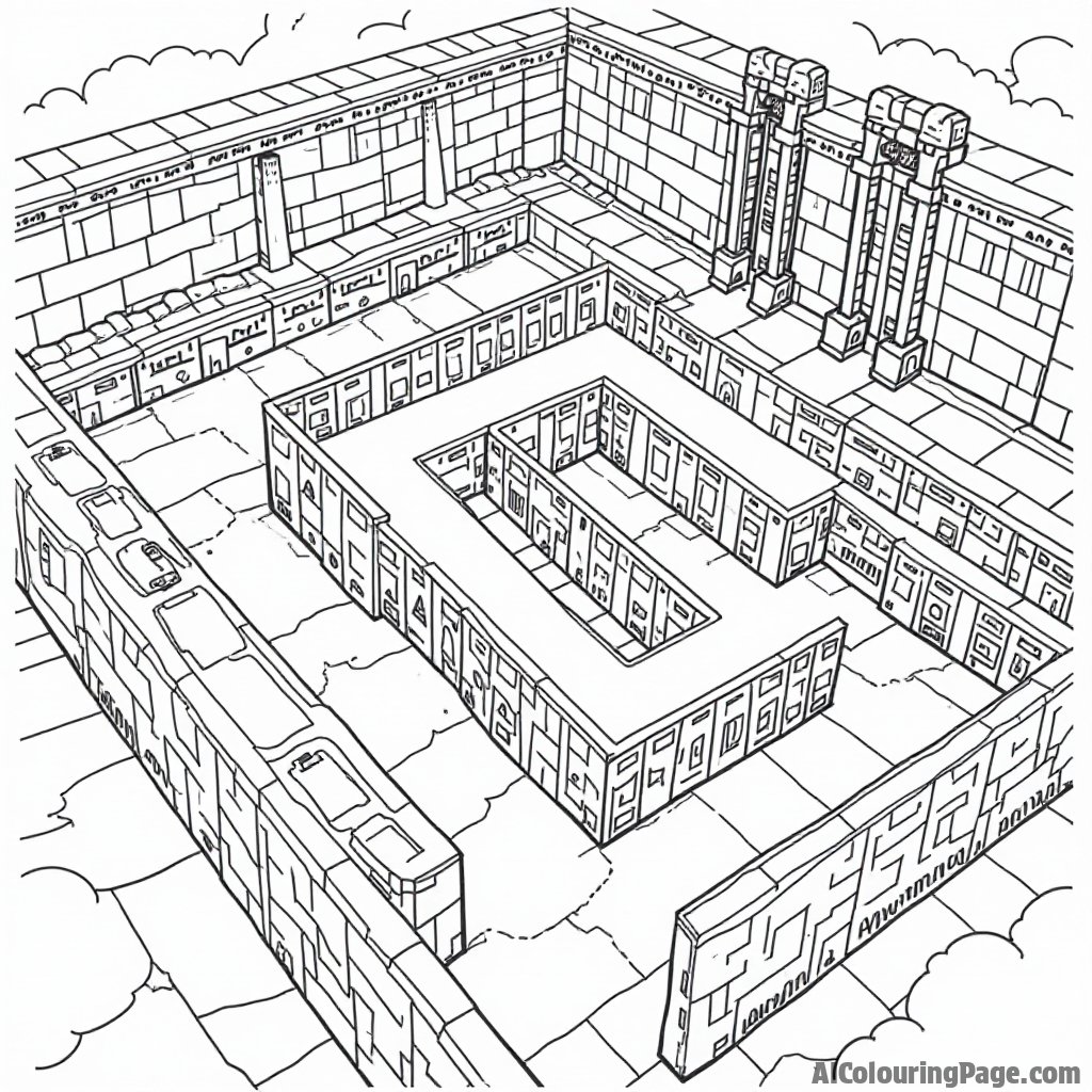
Color Analysis:
Color Recommendations
- Walls - Sandy Beige :
#C2B280 - Details and Carvings - Terracotta :
#D2691E - Ground - Desert Sand :
#EDC9AF - Sky - Pale Blue :
#ADD8E6 - Shadows - Slate Gray :
#708090
Analysis
The recommended colors are chosen to reflect the warm, earthy tones associated with ancient Egyptian architecture, particularly the pyramids. Sandy Beige and Desert Sand provide a neutral, muted backdrop that mimics the natural landscape of Egypt. Terracotta is used for the details to add a pop of warmth and highlight the architectural elements, reminiscent of the rich, clay-like colors found in Egyptian artifacts. The Pale Blue sky offers a gentle contrast to the warm earthy tones, providing a sense of openness and balance. Slate Gray is used for shading, adding depth and mimicking the natural shadows cast by the sun in a desert setting.
Tips for Coloring
Layering and Blending: Start with light layers of Sandy Beige and gradually build up the color, blending with Terracotta to create a seamless transition between the walls and details.
Shading for Depth: Use Slate Gray lightly to add shadows along the corners and edges. This will create a three-dimensional look, making the structure appear more realistic.
Highlighting: Consider using a white or very light-colored pencil to create highlights where light would naturally hit the surfaces, enhancing the dimensionality.
Textural Variation: Vary the pressure on your coloring tool to add texture to different areas. Use a softer touch for a smoother effect on the ground and a more textured application for the walls.
Color Proportion: Balance the warm earth tones with the cooler Pale Blue sky. Make sure the sky color does not overpower the foreground elements by keeping it light and slightly muted.
AdSense Placeholder (Slot: 6848953729)
Related Color Themes & Inspiration
Explore More Color Themes
Discover other popular color inspirations similar to pyramid