time Style Coloring Pages
9 AI-generated color inspirations for "time" theme coloring pages and artwork
Time-Themed Coloring Pages for All Ages
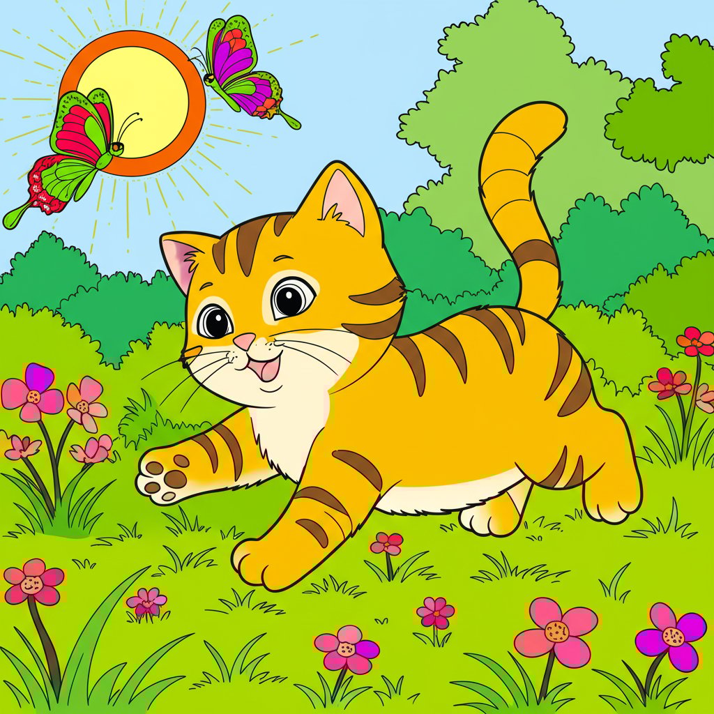
Coloring pages with a 'time' theme open a world of creativity and imagination, inviting you to explore different aspects of time and its passage. From intricate clocks to whimsical hourglasses, these designs encourage both relaxation and artistic expression. Engaging with time-themed pages might just prompt reflection on the past, present, and future, bringing a deeper meaning to your coloring experience.
Color Palette Suggestions
Picking the right colors can elevate your artwork. Below are some color suggestions that resonate well with the theme of time:
- Soft Blue: Represents tranquility and the vast sky.
- Golden Yellow: Symbolizes sunlight and the passing of days.
- Rich Purple: Evokes royalty and the enduring nature of time.
- Muted Green: Represents growth and the cycles of nature.
- Creamy Beige: Offers a warm backdrop echoing the sands of time.
- Crisp White: Conveys purity and clarity.
- Deep Brown: Suggests nostalgia and grounding.
Tips for Coloring in the 'Time' Style
Here are some practical tips to help you get the most out of your time-themed coloring pages:
- Use gradients: Blending colors can create depth in images like clocks or timelines.
- Experiment with patterns: Introduce unique designs within large areas to showcase the value of time.
- Incorporate metallics: Gold and silver can enhance elements like clock faces or cosmic themes.
- Add shadows: Simple shading techniques can bring a three-dimensional effect to your work.
Who This Theme Is Perfect For
Time-themed coloring pages cater to a wide audience. They are perfect for:
- Kids: Captivating designs that resonate with their budding understanding of time.
- Adults: Great for relaxation and mindfulness, tapping into nostalgic memories.
- Beginners: Simple patterns that are easy to color and provide immediate gratification.
- Art enthusiasts: Allowing for deep exploration in color theory and techniques.
In today's digital age, AI technology is reshaping how we create and enjoy art. Using AI to generate unique
Time Color Gallery & Examples
All Time Color Inspirations
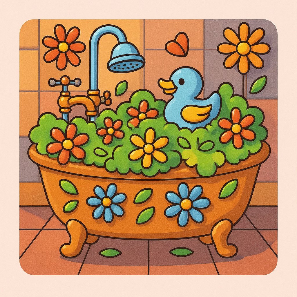
Visual Coloring
Sep 20, 2025
User's Prompt/Instruction:
cute bath time
Input Image:

Colored Result:
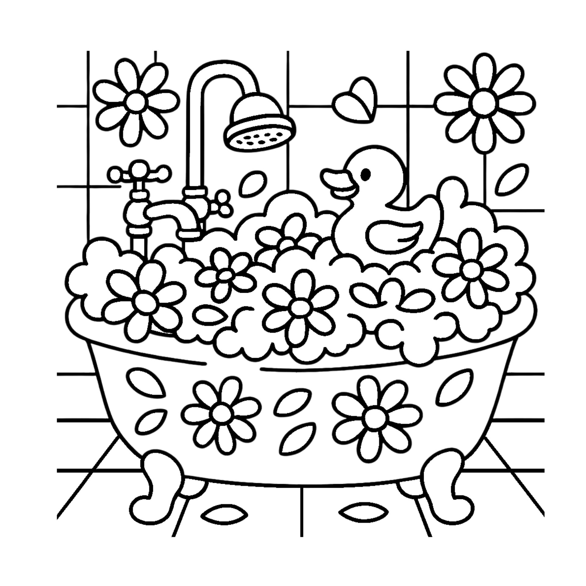
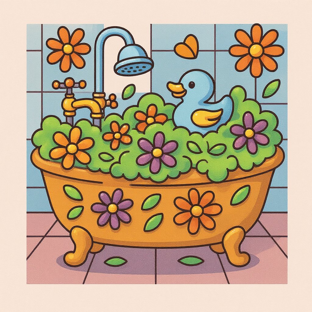
Visual Coloring
Sep 20, 2025
User's Prompt/Instruction:
cute bubble bath time
Input Image:
Colored Result:
Color Analysis
Jun 13, 2025
User's Prompt/Instruction:
Retro color scheme that reminds you of a time machine
Input Image:

Color Analysis:
Color Analysis
Jun 13, 2025
User's Prompt/Instruction:
Retro color scheme that reminds you of the lights on the time machine from back to the future. Please show many different colors
Input Image:

Color Analysis:
Color Analysis
Jun 13, 2025
User's Prompt/Instruction:
Retro color scheme that reminds you of the lights on the time machine from back to the future
Input Image:

Color Analysis:
Visual Coloring
May 9, 2025
User's Prompt/Instruction:
Winter time scene
Input Image:
Colored Result:

Color Analysis
May 9, 2025
User's Prompt/Instruction:
Winter time scene
Input Image:

Color Analysis:
Visual Coloring
May 4, 2025
User's Prompt/Instruction:
Use Chameleon Marker to color this in a colorful Summer time theme
Input Image:

Colored Result:

Related Color Themes & Inspiration
Explore More Color Themes
Discover other popular color inspirations similar to time