scheme Style Coloring Pages
9 AI-generated color inspirations for "scheme" theme coloring pages and artwork
AdSense Placeholder (Slot: 3395975636)
Vibrant Scheme Coloring Pages for Creative Minds
Welcome to our Scheme coloring page gallery! Dive into a world of intricate designs and vibrant color palettes created by advanced AI. Each page is tailored to inspire creativity and enhance your coloring experience. Whether you’re looking to unwind, boost your creativity, or engage in a fun activity with kids, our printable coloring pages offer endless possibilities. Get ready to transform these stunning patterns into colorful masterpieces!
Scheme Color Gallery & Examples
All Scheme Color Inspirations
Color Analysis
Jun 13, 2025
User's Prompt/Instruction:
Retro color scheme that reminds you of SMPTE color bars. Keep in mind that these colors may change every 5 seconds
Input Image:

Color Analysis:
Color Recommendations
- Top Cube - Dark Green:
#006600 - Middle Left Cube - Yellow:
#FFFF00 - Middle Right Cube - Cyan:
#00FFFF - Bottom Left Cube - Red:
#FF0000 - Bottom Middle Cube - Magenta:
#FF00FF - Bottom Right Cube - Blue:
#0000FF - Background - Gray:
#BEBEBE
Analysis
The recommended colors mirror the classic SMPTE color bars used in video broadcasting, which evoke a retro, vibrant feel. Each bold color contrasts sharply against the others, creating a striking visual that plays with perception and depth. The use of contrasting bright and dark colors also adds a dynamic, energetic vibe to the image, keeping the viewer's attention.
Tips for Coloring
Blending Techniques: Use a soft blender or white pencil to gently mix the colors within each cube to create a smoother transition and reduce harsh lines.
Shading Advice: Apply more pressure on one side of each cube to give the appearance of a light source and added dimension.
Adding Depth: Introduce a thin line of a darker shade along the edges of the cubes to enhance the 3D effect.
Texture Variation: Use cross-hatching or stippling techniques within each cube to create a textured effect, adding a retro vibe reminiscent of vintage graphic styles.
Consistent Background: Keep the background color consistent to maintain focus on the colorful cubes while providing a neutral base that complements the vivid hues.
Color Analysis
Jun 13, 2025
User's Prompt/Instruction:
Retro color scheme that reminds you of SMPTE color bars
Input Image:

Color Analysis:
Color Recommendations
- Top Row Cube - Light Cyan :
#00FFFF - Second Row Left Cube - Magenta :
#FF00FF - Second Row Middle Cube - Yellow :
#FFFF00 - Second Row Right Cube - Blue :
#0000FF - Third Row Left Cube - Red :
#FF0000 - Third Row Middle Cube - Green :
#00FF00 - Third Row Right Cube - White :
#FFFFFF - Background - Gray :
#808080
Analysis
The recommended colors are inspired by the classic SMPTE color bars, which are often used in television for testing. These colors are bright, bold, and provide a high-contrast, retro aesthetic. This palette is effective for creating a visually striking and nostalgic theme. The combination of primary and secondary colors with gray adds balance and ensures the cubes stand out against the background. Each color complements the others, creating a harmonious look reminiscent of vintage television screens.
Tips for Coloring
Consistent Pressure: Use consistent pressure when coloring to maintain uniformity, especially with vibrant colors.
Blending: For a seamless blend between colors (e.g., Magenta and Cyan), use colored pencils gently and overlap slightly.
Shading: Add depth by applying more pressure along the cube edges, softening towards the center, to give a three-dimensional effect.
Highlight with White: Use white pencil to blend and soften areas, providing a retro glow when combined with the bright colors.
Texture Variations: Experiment with different stroke techniques (cross-hatching, circular) to add visual interest and texture to the cubes.
Color Analysis
Jun 13, 2025
User's Prompt/Instruction:
Retro color scheme that reminds you of a time machine
Input Image:

Color Analysis:
Color Recommendations
- Top Cubes - Mustard Yellow:
#D4AF37 - Middle Cubes - Teal Blue:
#008080 - Bottom Cubes - Burnt Orange:
#CC5500 - Lines/Edges - Dark Brown:
#4B3621
Analysis
The retro color scheme is reminiscent of designs from the 1960s and 1970s, often characterized by warm, earthy tones combined with bold accents. The mustard yellow, teal blue, and burnt orange harmonize well, creating a nostalgic feel. The mustard yellow gives a gold-like appearance, adding a hint of sophistication, while the teal blue offers a cool contrast. The burnt orange provides warmth and energy, reminiscent of vintage interior designs. The dark brown lines outline the cubes, grounding the palette and highlighting retro aesthetics seen in mid-century furnishings and posters.
Tips for Coloring
Blending Techniques: Use a soft touch when blending the mustard yellow and burnt orange for a gradient effect, creating an aged, cohesive look.
Shading Advice: Add shadows with a darker shade of each color on one side of each cube to create a 3D effect, emphasizing the geometric nature.
Adding Depth: Apply a layer of very light brown or beige over the entire design to give a slightly faded, antique feel typical of retro styles.
Highlighting Edges: Use a small amount of white to lightly highlight cube edges to emphasize dimensionality and create contrast.
Texture Suggestions: For a textured look, use cross-hatching in the darker areas to mimic the rough, tactile surfaces often found in retro décor.
Color Analysis
Jun 13, 2025
User's Prompt/Instruction:
Retro color scheme that reminds you of LED lights
Input Image:

Color Analysis:
Color Recommendations
- Top Boxes - Cyan:
#00FFFF - Middle Boxes - Magenta:
#FF00FF - Bottom Boxes - Yellow:
#FFFF00 - Outlines - Black:
#000000
Analysis
The use of bright, vibrant colors such as cyan, magenta, and yellow mimic the feel of retro LED lights, which often have a bright and neon-like appearance. These specific colors form the secondary palette in color theory, which are visually striking and energetic, aligning well with the retro theme. The black outlines provide contrast and definition, helping the colors stand out and creating a crisp, clear visual structure.
Tips for Coloring
Blending Techniques: Use a blending pencil or a soft tissue to gently blend the edges where two colors meet, creating a smooth transition that mimics the glow of LED lights.
Layering Colors: Start with a lighter pressure when applying color, then gradually build up layers to intensify the vibrancy. This approach will enhance the LED-like effect.
Adding Depth: Introduce a small amount of dark blue or deep purple to the edges of the boxes to give them a 3D effect, enhancing the retro-futuristic appearance.
Texture Variation: For a slightly different texture, consider using colored pencils for the background and gel pens for the boxes. The gel pens will make the colors pop, resembling the glow of actual lights.
Highlighting: Leave small areas white or use a white gel pen to add highlights and create a reflective look, similar to light bouncing off a shiny surface.
Color Analysis
Jun 13, 2025
User's Prompt/Instruction:
Retro color scheme that reminds you of the lights on the time machine from back to the future. Please show many different colors
Input Image:

Color Analysis:
Color Recommendations
- Top Cubes - Neon Blue:
#00FFFF - Middle Cubes - Electric Purple:
#9370DB - Bottom Cubes - Bright Pink:
#FF69B4 - Cube Edges - Bright Yellow:
#FFFF00 - Background - Deep Black:
#000000
Analysis
The chosen colors reflect a retro-futuristic palette reminiscent of classic sci-fi, particularly inspired by the vibrant lights seen on the iconic time machine from "Back to the Future." Neon Blue and Electric Purple capture the quintessential 80s aesthetic often associated with digital and technological innovation. Bright Pink adds a playful contrast, while Bright Yellow for the edges enhances the sharp, dynamic appearance of the geometric design. Deep Black for the background makes the neon colors pop, creating a striking visual effect that suggests depth and dimensionality.
Tips for Coloring
Blending and Transitions: Graduated shading between the Electric Purple and Neon Blue can create a holographic effect, enhancing the futuristic vibe.
Highlight Edges: Use a white or very light pencil to add highlights on the cube edges. This will enhance the three-dimensional effect and mimic the glow of neon lights.
Depth with Shadows: Use darker shades of purple and blue along the bottom areas of each cube to create depth. Consider how light would naturally fall on the cubes.
Accent with Glitter: To simulate the sparkle of neon lights, consider using glitter gel pens or metallic markers on some edges or highlights.
Uniform Background: Ensure the Deep Black background is evenly applied to give the neon colors maximum contrast, emphasizing their brightness and vividness.
Color Analysis
Jun 13, 2025
User's Prompt/Instruction:
Retro color scheme that reminds you of the lights on the time machine from back to the future
Input Image:

Color Analysis:
Color Recommendations
- Top Row Cubes - Neon Pink:
#FF6EC7 - Middle Row Cubes - Electric Blue:
#7DF9FF - Bottom Row Cubes - Bright Yellow:
#FFFF33 - Cube Outlines - Dark Grey:
#404040
Analysis
The recommended colors are inspired by a retro, vibrant palette reminiscent of 1980s aesthetics, similar to the lighting effects from "Back to the Future." Neon pink, electric blue, and bright yellow create a lively contrast and energetic vibe, capturing the essence of that era. Dark grey outlines serve as a grounding element, ensuring each cube stands out without overshadowing the vivid interior colors. This combination effectively balances vibrancy with clarity, maintaining a sense of nostalgia and futuristic excitement.
Tips for Coloring
Gradient Techniques: For a dynamic effect, create gradients within each cube. Blend the neon pink, electric blue, and bright yellow with a white pencil starting from the center to the edges, for a glowing effect.
Shading: Use a darker shade of each main color along the edges of the cubes to add depth and dimension. This will enhance the 3D feel and make the cubes appear more luminous.
Texture: Apply a light, cross-hatching technique with colored pencils on the cube surfaces. This can mimic the reflective, shiny texture often seen in retro-futuristic designs.
Contrast Enhancement: To amplify the vibrancy, ensure the cube outlines remain dark. Touch up with a fine black pen if necessary after coloring to redefine edges.
White Highlights: Add small white highlights or dots in corners using a gel pen to simulate the sparkle and shine of neon lights.
Color Analysis
Jun 13, 2025
User's Prompt/Instruction:
Retro color scheme
Input Image:
Color Analysis:
Color Recommendations
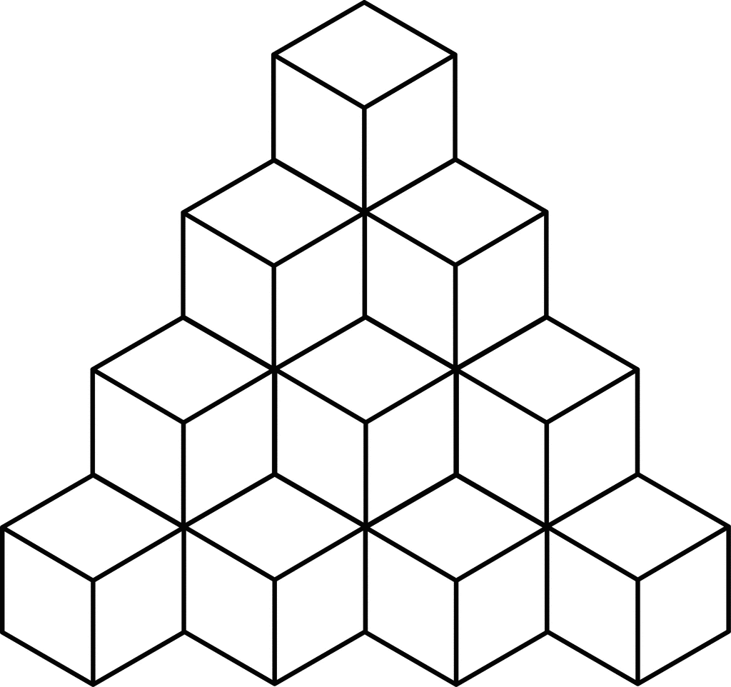
- Top Cube - Mustard Yellow:
#FFDB58 - Middle Cube - Teal Blue:
#008080 - Bottom Cube - Burnt Orange:
#CC5500 - Shadowed Sides - Olive Green:
#556B2F - Background - Cream:
#FFFDD0
Analysis
The retro color scheme draws from palettes popular in the 1960s and 70s. Mustard yellow and burnt orange evoke nostalgia, often seen in mid-century modern design. These colors work together by offering a warm yet vibrant contrast, enhancing the geometric shapes of the cubes. Teal blue adds a cool, subdued contrast, balancing the warm tones. Olive green shadows provide earthy depth, emphasizing the cube's three-dimensionality. The cream background keeps the focus on the cubes while complementing the entire retro palette.
Tips for Coloring
Layering: Use light, consistent strokes to layer colors. Begin with lighter shades, gradually adding layers for deeper hues, especially for shadows and highlights.
Blending: To achieve a smooth transition between the shadowed sides and the main cube colors, use a blending tool or gently blend with your fingertips.
Shading: Enhance the 3D effect by shading edges and sides with slightly darker variants of the main colors. For example, use a darker mustard or burnt orange on edges farther from the light source.
Texture: Add texture by varying pressure. Light pressure creates a soft wash of color, while heavier pressure deepens the saturation for more emphasis.
Contrast: Maintain clean lines between each cube to ensure they stand out. Consider outlining in a slightly darker shade of the main color to increase definition.
Visual Coloring
Jun 2, 2025
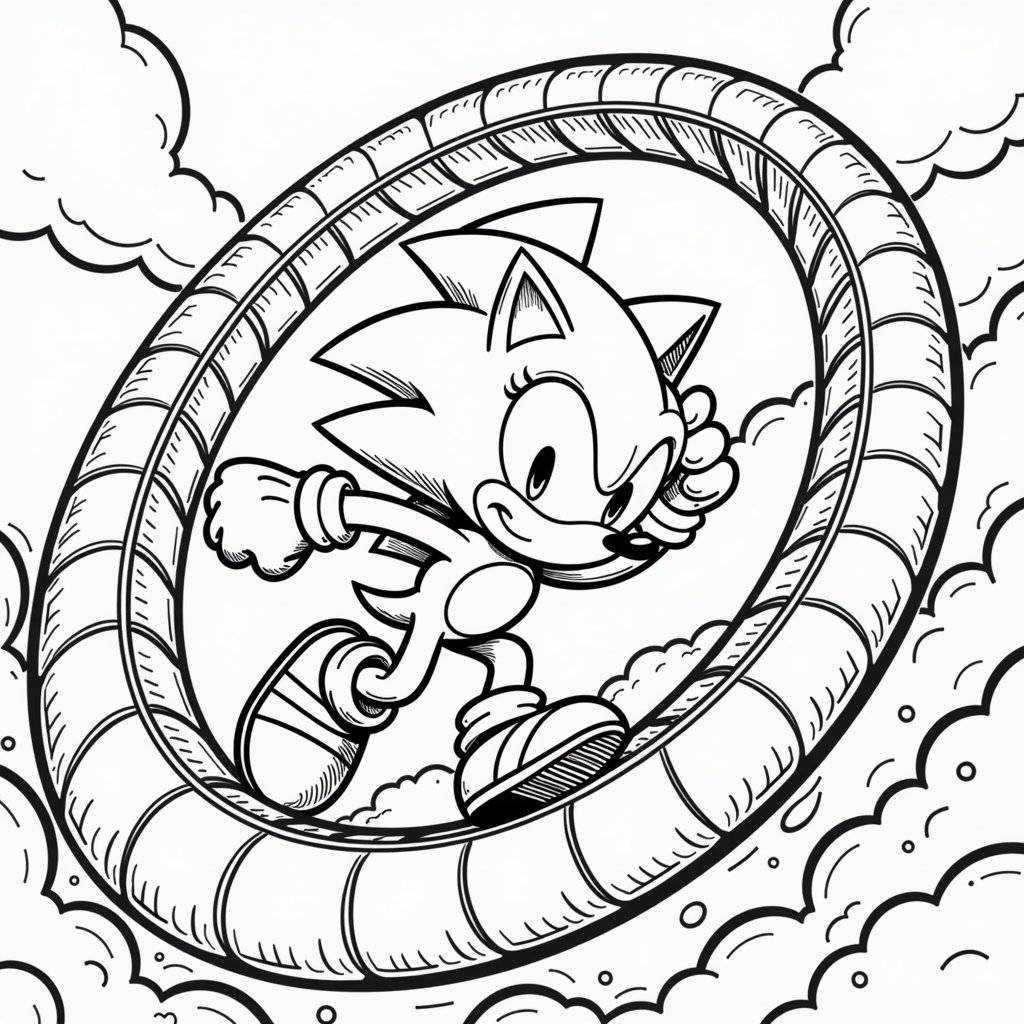
User's Prompt/Instruction:
90s cartoon color scheme
Input Image:
Colored Result:

AdSense Placeholder (Slot: 6848953729)
Related Color Themes & Inspiration
Explore More Color Themes
Discover other popular color inspirations similar to scheme
