light Style Coloring Pages
12 AI-generated color inspirations for "light" theme coloring pages and artwork
AdSense Placeholder (Slot: 3395975636)
Illuminate Your Creativity with Light Coloring Pages
Light-themed coloring pages invite you into a world where brightness and color converge to create a serene artistic experience. This style emphasizes brightness, warmth, and a sense of positivity, allowing users to engage with their creativity in a way that feels uplifting. Whether you’re looking to relax or seeking joy, light coloring pages provide a canvas for artistic expression that radiates happiness.
Color Palette Suggestions
Creating a visual masterpiece in the light style requires careful consideration of colors that evoke brightness and appeal. Here are some palette suggestions to get you started:
- Soft Yellow
- Pale Blue
- Mint Green
- Coral Pink
- Lavender
- Light Peach
- Pastel Orange
Tips for Coloring in the Light Style
To fully embrace the light theme in your coloring pages, here are some practical tips to enhance your experience:
- Start with lighter shades to create a soft base before adding depth with darker hues.
- Experiment with blending colors to achieve a luminous effect.
- Use white space intentionally to enhance the feeling of light and openness in your artwork.
- Incorporate metallic or iridescent gel pens for highlights to add an extra layer of sparkle.
- Don’t be afraid to mix pastel colors for a tranquil and dreamy vibe.
Who This Theme is Perfect For
The light coloring theme is ideal for anyone looking to channel a sense of peace and creativity. It’s particularly suitable for:
- Kids who enjoy vibrant and cheerful art.
- Adults seeking a mindful escape through art therapy.
- Beginners learning the basics of color blending and shade.
- Artists with an appreciation for pastel and soft color schemes.
- Anyone looking to brighten their mood through creativity.
Embrace the power of AI to generate unique light-themed coloring pages tailored to your preferences. With just a few taps, you can access an array of stunning and personalized designs that illuminate your coloring journey. Let your imagination shine as you bring these pages to life!
Light Color Gallery & Examples
All Light Color Inspirations
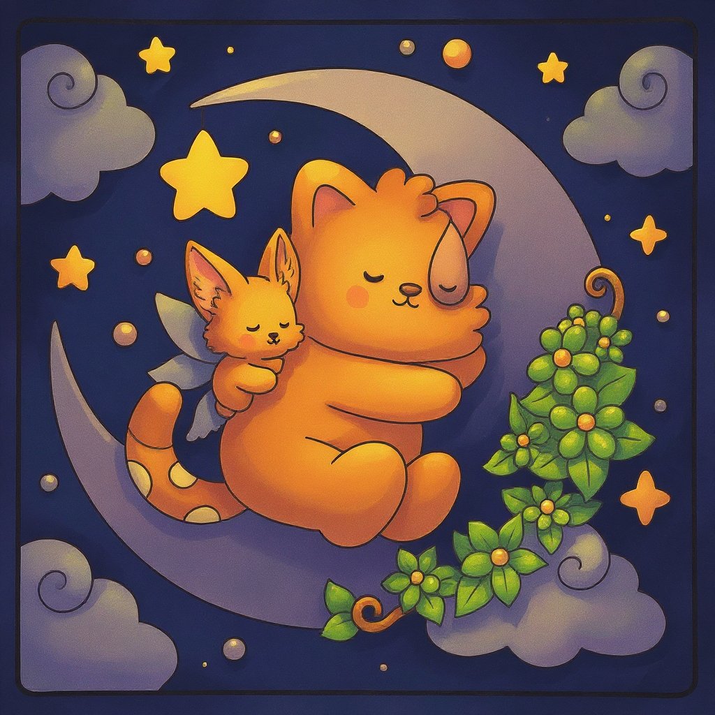
Visual Coloring
Oct 2, 2025
User's Prompt/Instruction:
dreamy night light colors
Input Image:
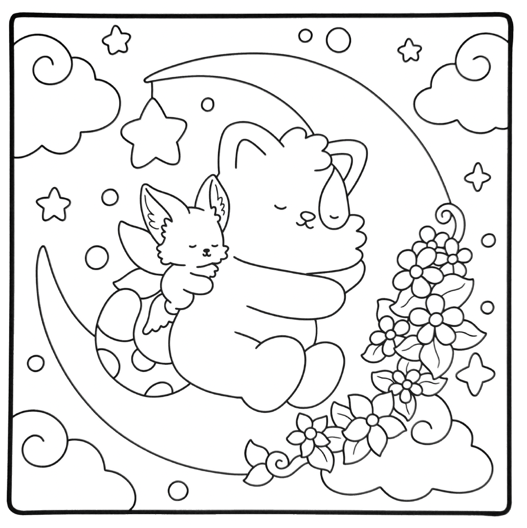
Colored Result:
Color Analysis
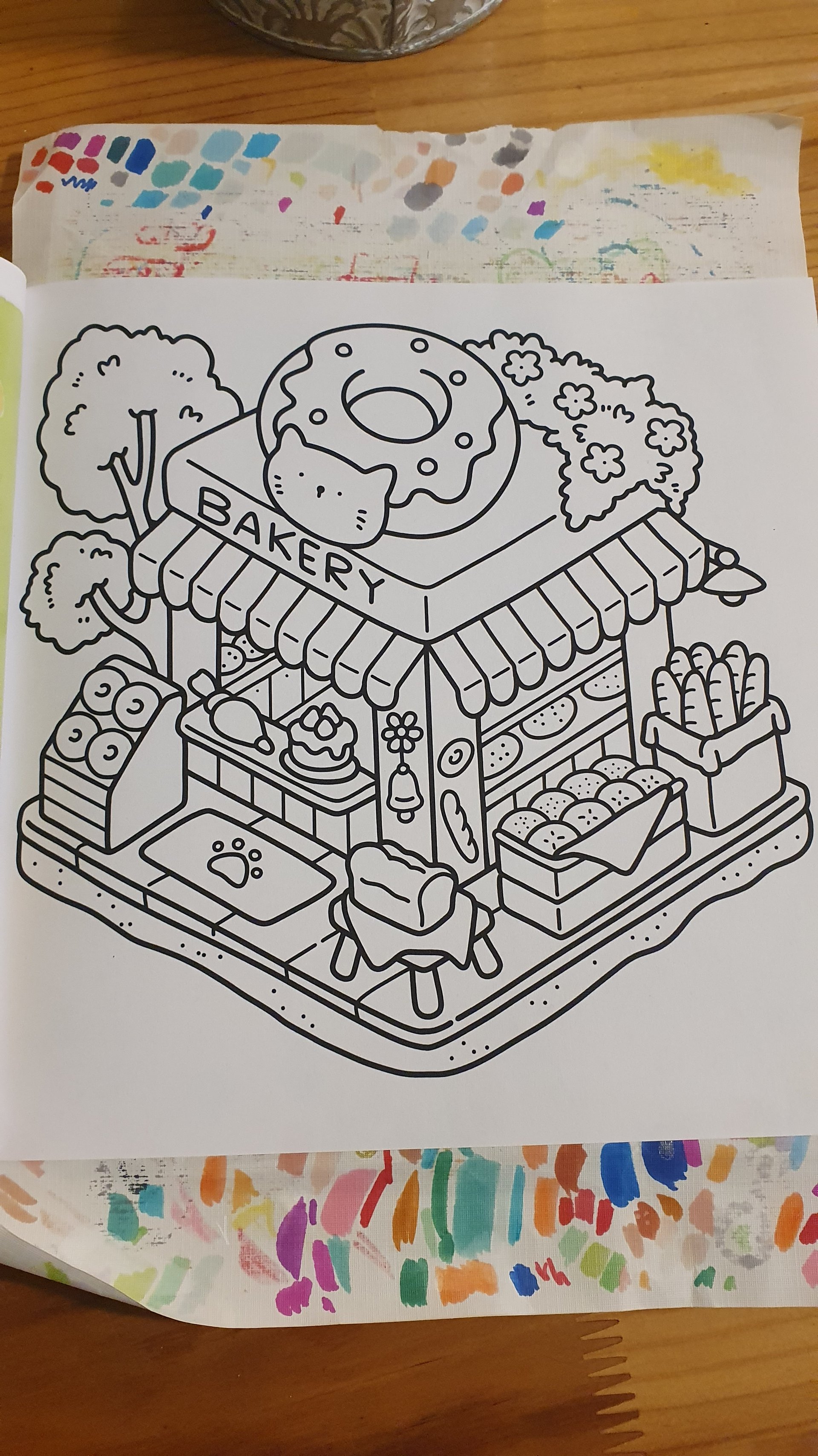
Sep 18, 2025
User's Prompt/Instruction:
Morning light
Input Image:

Color Analysis:
Color Recommendations
- Sky - Light Blue:
#87CEEB - Bakery Exterior - Soft Yellow:
#FFFACD - Roof Canopy - Red:
#FF6347 - Tree Leaves - Fresh Green:
#90EE90 - Tree Trunk - Brown:
#8B4513 - Bread - Golden Brown:
#D2B48C - Donut - Soft Pink:
#FFC0CB - Planter Box - Dark Green:
#228B22 - Ground - Light Gray:
#D3D3D3
Analysis
The theme of "Morning Light" suggests a fresh, inviting atmosphere. Soft yellows and light blues enhance the feeling of a bright morning, evoking a sense of warmth and tranquility. Light blues for the sky are calming and amplify the freshness of the morning. The soft yellow for the bakery exterior conveys warmth and welcome, which is crucial for attracting customers. Accenting the roof and donut with shades of red and pink adds vibrancy and draws the eye, ensuring the focal points are engaging. The greens for trees and planters emphasize nature and invite a soothing balance, complementing the bakery's inviting aura.
Tips for Coloring
Blending for Sky: Use a gradient technique by blending light blue with touches of white near the top to mimic the morning sky.
Shading for Tree Leaves: Add depth by layering different shades of green, ranging from fresh green to dark green, for a textured and volumetric effect.
Creating Texture in Bread: Use a stippling technique with golden brown to add realistic crusty textures to the bread.
Highlighting with White: Use a white pencil or gel pen to add highlights on glossy surfaces like the donut glaze and windows to reflect light accurately.
Depth in Bakery Exterior: Use gentle strokes of a slightly darker yellow around the edges and beneath the canopy for shading to create a sense of dimension.
Color Analysis
Sep 18, 2025
User's Prompt/Instruction:
Morning light
Input Image:
Color Analysis:
Color Recommendations
- Sky - Light Blue:
#87CEEB - Bakery Awning - Pastel Yellow:
#FFFACD - Building Walls - Soft Peach:
#FFDAB9 - Roof - Coral Pink:
#FF6F61 - Tree Leaves - Fresh Green:
#7CFC00 - Donut - Golden Brown:
#DAA520 - Bakery Sign - Deep Chocolate:
#8B4513 - Display Breads - Warm Beige:
#F5DEB3 - Window - Light Gray:
#D3D3D3
Analysis
The theme of "Morning Light" is perfectly captured through the use of soft, warm colors that mimic the gentle hues seen at sunrise. Light Blue in the sky suggests serenity and clarity, setting a peaceful backdrop. The Pastel Yellow of the awning embodies the warmth and optimism of morning sunshine. Soft Peach walls add a gentle, welcoming feel, while Coral Pink on the roof provides a vibrant yet harmonious contrast.
The natural greens for the trees offer a refreshing pop of color, evoking the feeling of nature coming to life in the morning. The use of Golden Brown for the donut suggests comfort and warmth, reminiscent of freshly baked goods. The Deep Chocolate for the bakery sign adds depth and balances the lighter colors. Warm Beige for the bread keeps the palette cohesive and appetizing.
Tips for Coloring
Blending Techniques: Use colored pencils to softly blend the Pastel Yellow and Peach shades for the building walls to achieve a subtle gradient effect that mimics early morning light.
Shading Advice: Add depth to the tree leaves by layering a darker green on top of the Fresh Green at the bottom of each leaf to suggest shadows and light filtering through.
Texture Suggestions: Create a textured effect on the donut by adding small, light strokes of Golden Brown and then blending with a lighter cream color on top for a glazed look.
Contrast and Balance: Ensure the Coral Pink roof stands out by keeping the surrounding elements, like the window and door frames in Light Gray, subdued yet complementary.
Highlighting: Use a white gel pen to add highlights on the glass of the window and on top of the bread to simulate the reflection of morning light.
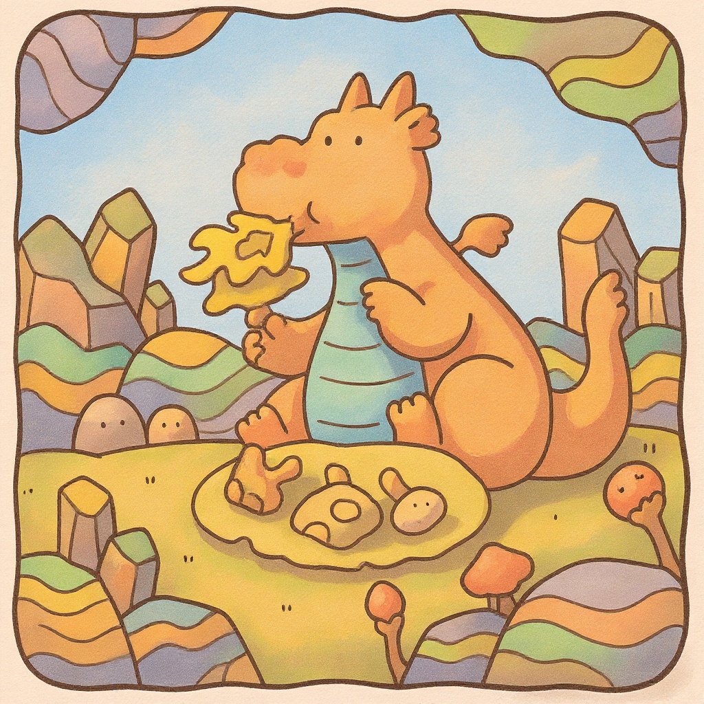
Visual Coloring
Sep 18, 2025
User's Prompt/Instruction:
light pastel
Input Image:
Colored Result:
Visual Coloring
Aug 28, 2025
User's Prompt/Instruction:
.Soft pastel colors—baby pink, mint green, and light sky blue—blended smoothly to give a dreamy, gentle look.
Input Image:
Colored Result:
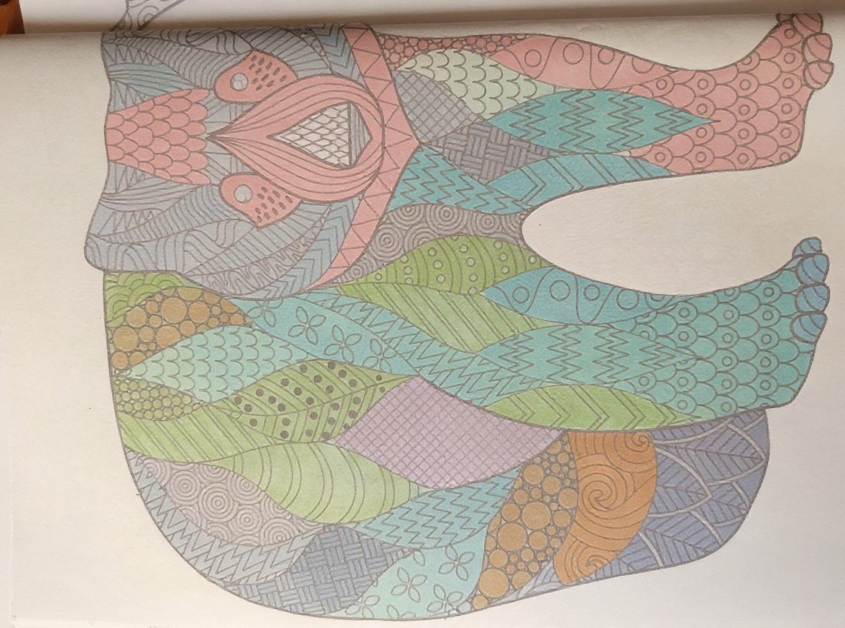
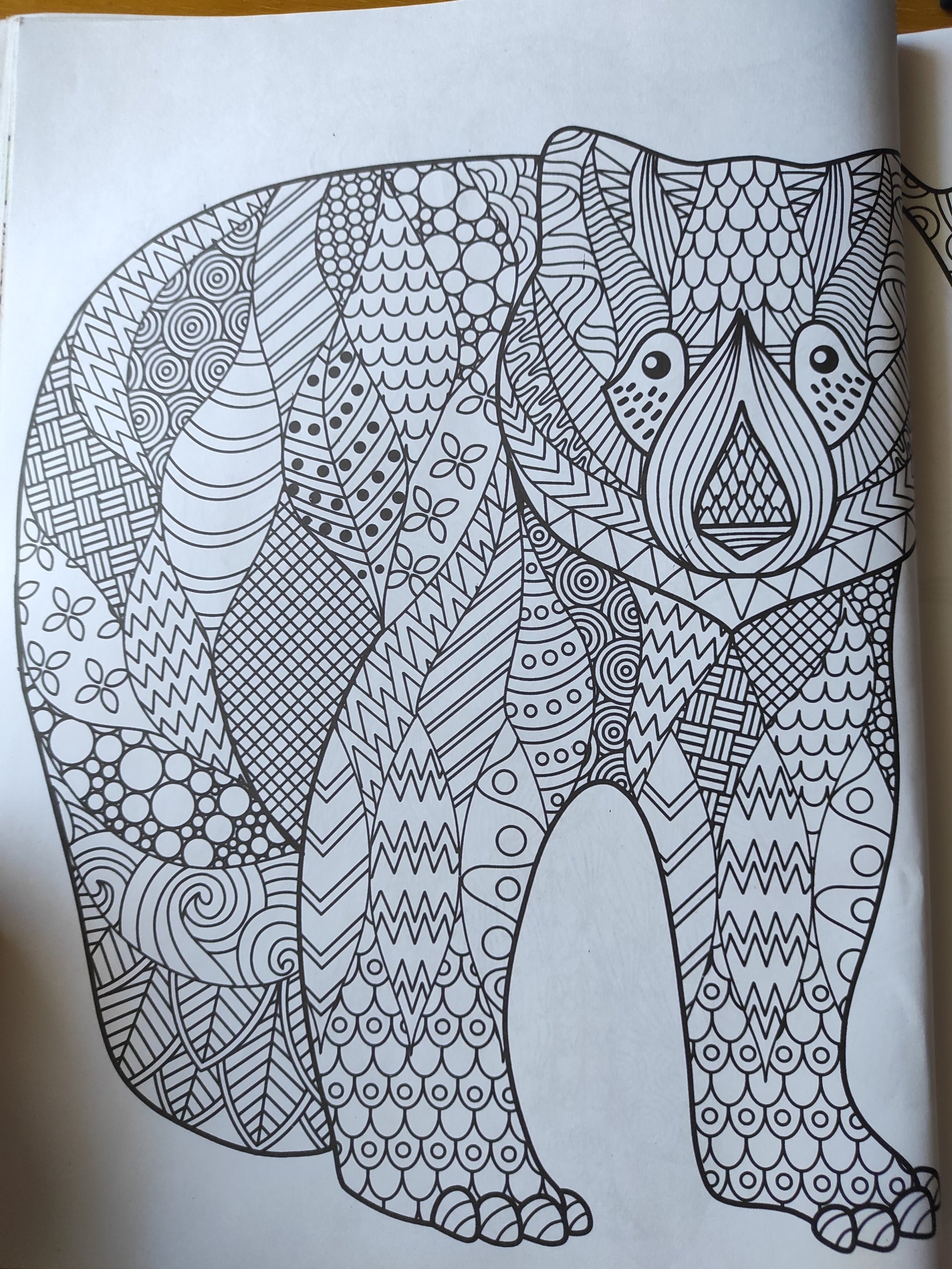
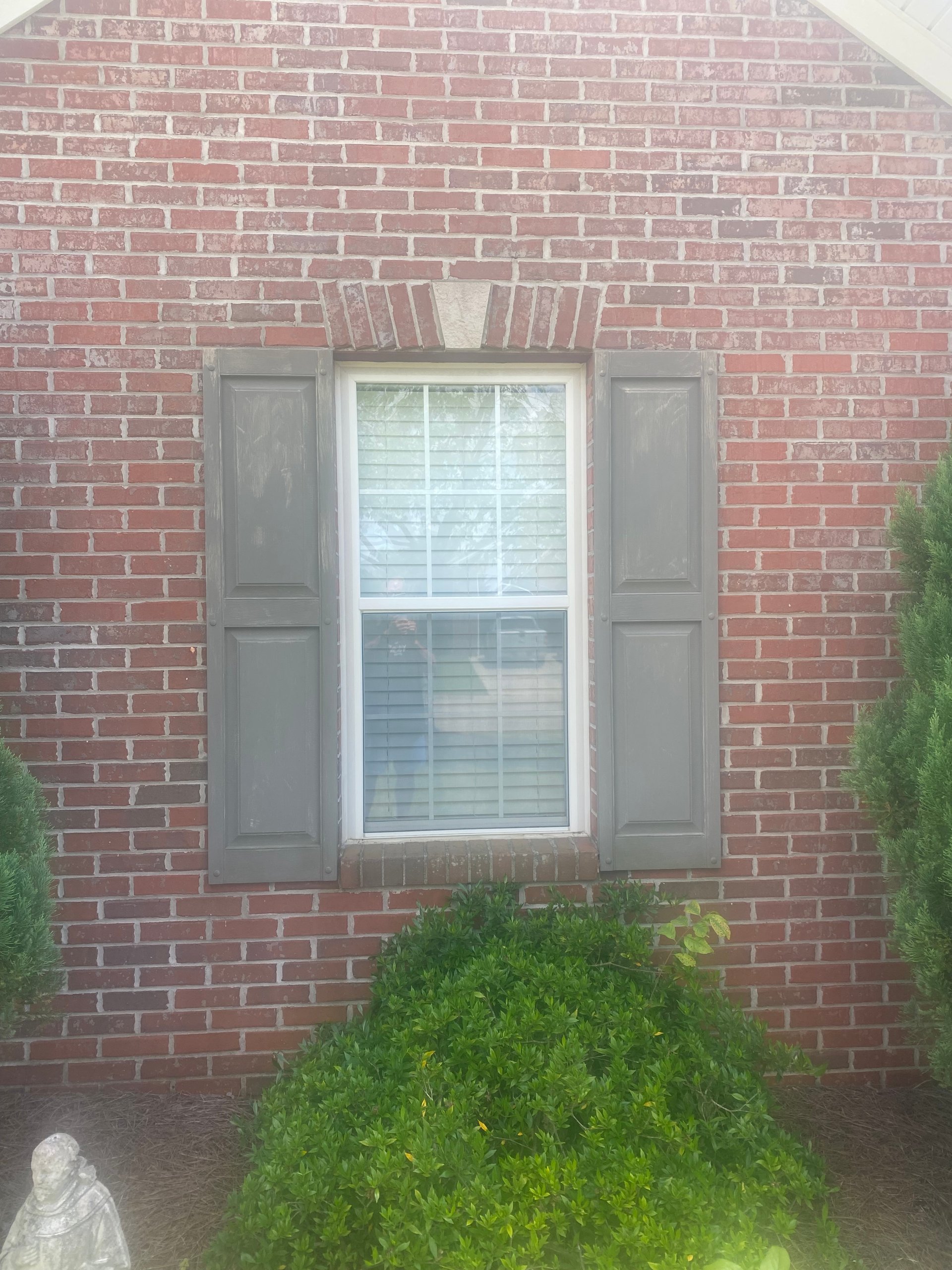
Visual Coloring
Jul 14, 2025
User's Prompt/Instruction:
Light gray shutters
Input Image:
Colored Result:
Color Analysis
Jun 13, 2025
User's Prompt/Instruction:
retro colors on an LED light
Input Image:

Color Analysis:
Color Recommendations
- Top Left Cube - Neon Pink:
#FF6EC7 - Top Middle Cube - Electric Blue:
#7DF9FF - Top Right Cube - Lime Green:
#32CD32 - Middle Left Cube - Bright Orange:
#FFA500 - Center Cube - Vibrant Yellow:
#FFFF00 - Middle Right Cube - Turquoise:
#40E0D0 - Bottom Left Cube - Hot Pink:
#FF69B4 - Bottom Middle Cube - Aqua:
#00FFFF - Bottom Right Cube - Pale Violet:
#EE82EE
Analysis
The selected colors are based on a retro theme often seen in 1980s graphic designs and LED displays. These colors have high brightness and saturation, capturing the vibrant and energetic aesthetic of the era. Neon pink, electric blue, and lime green are typical of retro lighting and graphics, providing a sense of nostalgia and dynamic energy.
The colors work well together because they utilize analogous and complementary relationships. For instance, the combination of vibrant yellow and bright orange creates harmony, while contrasts like pink and green provide visual interest and liveliness.
Tips for Coloring
Blending Technique: Use a soft blending tool or your fingertip to merge colors gently where cubes meet for a glowing transition effect.
Shading Advice: Begin coloring lightly and gradually build up layers. Add a slightly darker shade on the edges of each cube to create depth and a 3D effect.
Adding Texture: Introduce subtle hatching or stippling within each cube to mimic the grainy appearance of retro LED displays.
Highlighting: Use white or a very light yellow in small areas to simulate light reflection, enhancing the illuminated look of the cubes.
Balance and Contrast: Balance bright colors with some neutral tones in surrounding areas if applicable, to prevent the design from becoming overwhelming.
Color Analysis
Jun 13, 2025
User's Prompt/Instruction:
retro colors on an LED light
Input Image:
Color Analysis:
Color Recommendations
- Top Cube - Neon Pink:
#FF6EC7 - Middle Row Cubes - Bright Teal:
#00F9FF - Bottom Cubes - Electric Blue:
#7DF9FF - Background - Deep Purple:
#800080
Analysis
The color choices are inspired by a retro theme often associated with vibrant and electric hues typical of the 1980s aesthetic. Neon pink is dynamic and eye-catching, while bright teal adds a splash of energetic coolness. Electric blue complements the palette with its vivid saturation, enhancing the lively aesthetic. Deep purple as a background color provides contrast and depth, grounding the bright colors and adding a hint of mystery, which is synonymous with retro styles often seen in vintage arcade games or neon signs.
Tips for Coloring
Blending Techniques: For a smooth transition between colors, especially where cubes touch, use a light hand to layer colors gradually. Start with the lighter color and gently blend the darker color over it.
Shading Advice: To add dimension, apply a slightly darker shade on one side of each cube to mimic a light source. This will enhance the 3D effect of each element.
Adding Depth: Use a bit of white or a lighter shade in the middle of the cubes to give them a glowing effect, reinforcing the LED light theme.
Texture Suggestions: To create a textured look that emulates old-style LED displays, consider stippling (dotting) in the color application. This can simulate a pixelated effect characteristic of retro technology.
Highlighting: Apply white or a pastel color sparingly on edges to add highlights, which can create a sense of polish and enhance the vibrancy of neon colors.
Color Analysis
Jun 13, 2025
User's Prompt/Instruction:
retro colors on and LED light
Input Image:

Color Analysis:
Color Recommendations
- Cube Face 1 - Neon Pink:
#FF6EC7 - Cube Face 2 - Electric Blue:
#7DF9FF - Cube Face 3 - Bright Yellow:
#FFFF66 - Background - Deep Purple:
#8903A0
Analysis
The recommended colors are chosen to reflect a retro aesthetic commonly associated with vibrant, neon hues reminiscent of the 1980s. Neon Pink and Electric Blue capture the lively, dynamic essence of the era, while Bright Yellow adds energy and optimism. Deep Purple in the background provides a rich, contrasting backdrop that allows the neon colors to stand out more vividly. This combination mimics the glow of retro LED lights, enhancing the nostalgic theme.
Tips for Coloring
Blending Neon Colors: Use a lighter pressure when first applying the colors and gradually build up the intensity to create a glowing effect typical of LED lights. Layer Electric Blue and Neon Pink lightly at the edges where they meet to create a soft blend.
Creating Depth: Add a touch of white to the center of each cube face to simulate light reflecting off the surface. This will give the illusion of depth and make the cubes appear three-dimensional.
Emphasizing the Retro Feel: Use a stippling technique with a fine tip in the background to mimic the grainy texture of old LED displays, enhancing the retro vibe.
Shading Advice: Apply deeper shades of the same colors (e.g., Dark Magenta, Royal Blue) along the edges of each cube face to add shadow and dimension.
Maintaining Clean Lines: Use a ruler or straight edge when coloring the edges to ensure precise application, emphasizing the geometric nature and clean lines of the design.
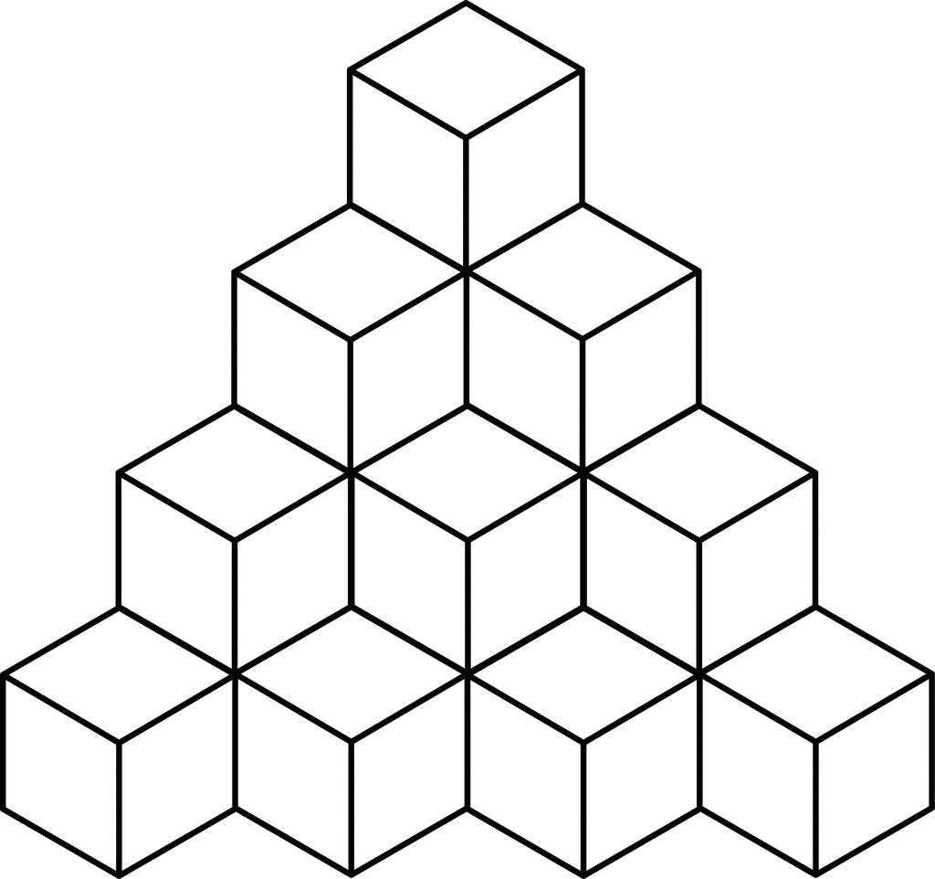
Color Analysis
Jun 13, 2025
User's Prompt/Instruction:
I want to show LED lights that have a retro color pallette that reminds you of SMPTE color bars that you would see on a television screen. Please provide 10 different colors that would work on an actual LED light.
Input Image:

Color Analysis:
Color Recommendations
- Front Face 1 - Light Pink:
#FFC0CB - Front Face 2 - Cyan:
#00FFFF - Front Face 3 - Yellow:
#FFFF00 - Side Face 1 - Light Green:
#32CD32 - Side Face 2 - Blue:
#0000FF - Top Face 1 - Magenta:
#FF00FF - Top Face 2 - Red:
#FF0000 - Side Face 3 - Dark Green:
#008000 - Top Face 3 - Orange:
#FFA500 - Front Face 4 - Violet:
#8A2BE2
Analysis
The selected colors mimic the vibrant retro palette reminiscent of SMPTE color bars. These colors are highly saturated and evoke a sense of nostalgia and playfulness. Using these colors for LEDs conveys vivid brightness and clarity, making each cube segment distinct yet harmoniously part of a unified design. The contrast between adjacent colors can enhance visual interest and guide the viewer's eye through the composition, maintaining a captivating balance between the old-school appeal and modern LED vibrancy.
Tips for Coloring
Blending Technique: Use a small blending tool or a soft brush to gently merge the edges where two contrasting colors meet. This can soften transitions while maintaining each color's distinctive vibrancy.
Shading Advice: Add subtle shading with a light grey or a slightly darker shade of each color on one side of the cubes to simulate depth and dimensionality. This can give the illusion of light reflecting off a surface.
Layering Method: Apply the colors in layers—start with a base layer and slowly add more to achieve the desired saturation and intensity. This can help you achieve a more even application and richer color.
Texture Addition: To simulate the glow of LED lights, consider adding a slight halo effect around the edges of each colored section with a white pencil or paint pen.
Consistency: Keep the application consistent across similar elements to maintain cohesiveness. Ensure that the texture and saturation are uniform across all cubes to prevent one area from overpowering the others.
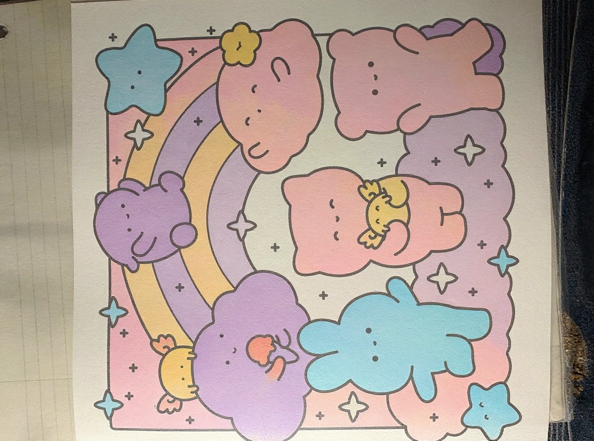
Visual Coloring
Jun 8, 2025
User's Prompt/Instruction:
Kawaii pastels, pinks, purples, light blues
Input Image:
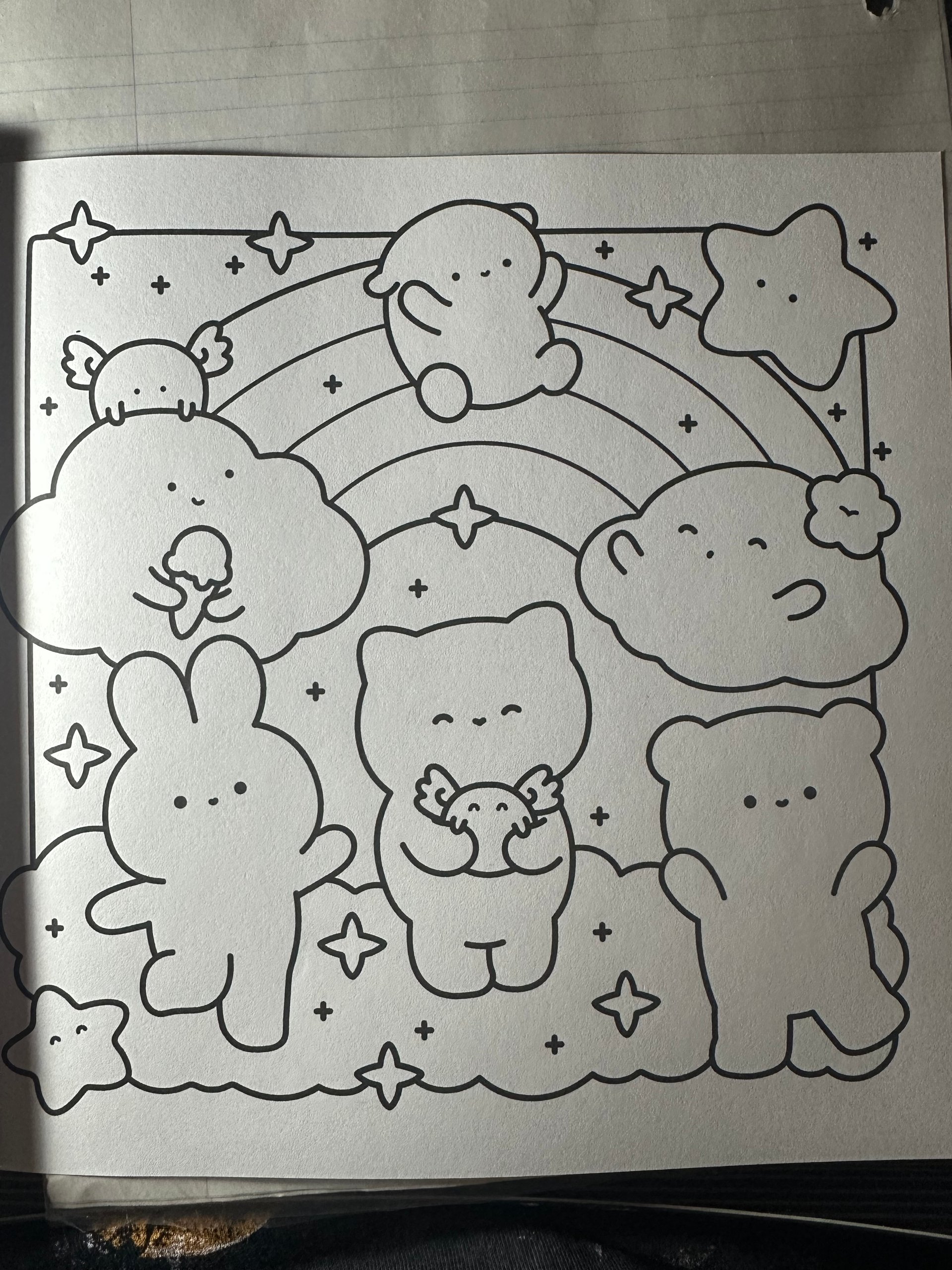
Colored Result:
Color Analysis
May 9, 2025
User's Prompt/Instruction:
watercolour effect. horses in blues, pinks and purples. Background to be in yellows, pinks and light browns.
Input Image:
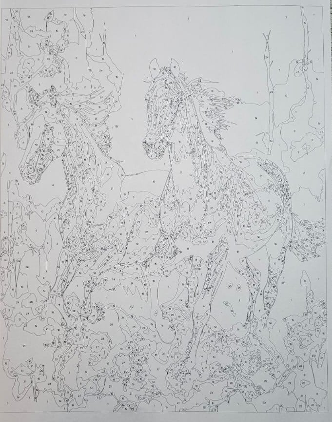
Color Analysis:
Color Recommendations
- Horses - Soft Blue:
#ADD8E6 - Horses - Pastel Pink:
#FFC0CB - Horses - Lavender:
#E6E6FA - Background - Light Yellow:
#FFFFE0 - Background - Soft Pink:
#FFB6C1 - Background - Light Brown:
#D2B48C
Analysis
The chosen colors enhance the watercolor effect and maintain a harmonious balance. Blues, pinks, and purples provide a dreamy and ethereal look to the horses, conveying a sense of movement and grace. These colors are soothing and evoke a sense of calmness.
The background colors are warm and inviting; light yellow adds brightness, soft pink brings warmth, and light brown gives a natural touch. Together, they create contrast and depth, keeping the composition engaging and lively without overpowering the delicate hues of the horses.
Tips for Coloring
Blending Softly: To achieve the watercolor effect, apply colors in light, overlapping layers. Blend blue, pink, and purple smoothly on the horses to create a seamless transition between hues.
Shading and Depth: For depth, use a slightly darker shade of the main colors on the shadow areas of the horses. This will add a three-dimensional look while maintaining the soft aesthetic.
Textural Variety: Use a mix of strokes and dabbing techniques to mimic watercolor textures. This adds interest and variety to the flat areas.
Color Harmony: Ensure the colors are balanced by using the background shades sparingly to maintain focus on the horses.
Highlighting: Use white or a very light yellow to add highlights on the horses to enhance the illusion of light reflecting off their coats.
AdSense Placeholder (Slot: 6848953729)
Related Color Themes & Inspiration
Explore More Color Themes
Discover other popular color inspirations similar to light